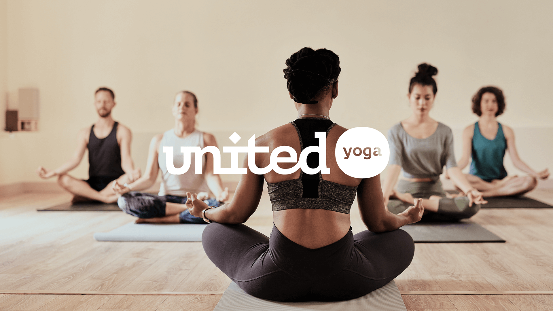
United Yoga
United in movement. Unity with each other, regardless of background. United yoga stands for inclusion and keeps it honest. They believe in the benefits of consistent yoga practice and think it should be accessible for everyone. Their team supports this by offering memberships, regardless of the number of coins you have in your pocket.
We felt a humanist identity was fit. The design system is neutral enough to include everybody but bold enough to stand out.
Client: United Yoga
Service: Branding
Industry: Wellbeing
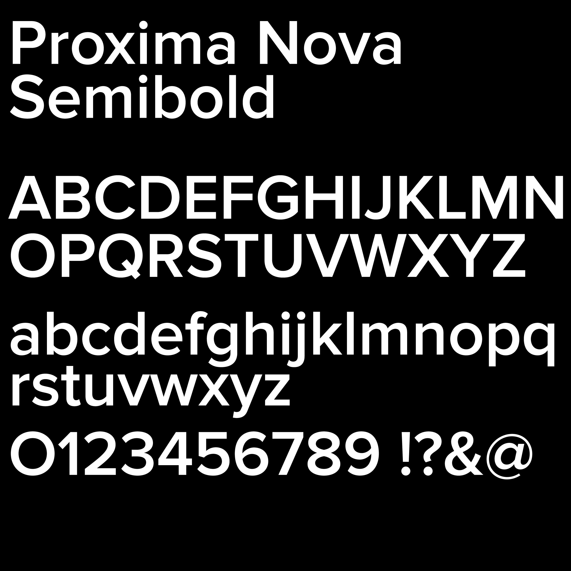
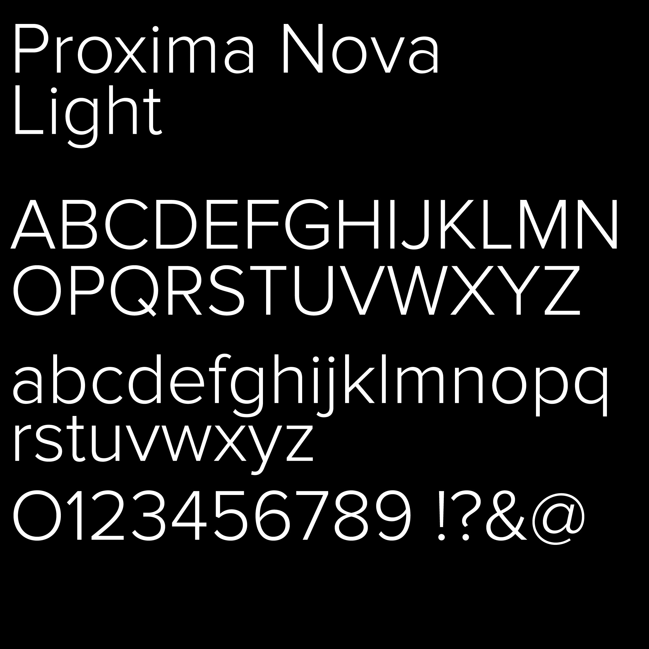
We went for an accessible typeface for a brand identity that means to speak to everybody. We needed a humanist typeface with a geometric and kind appearance. We opted for Proxima Nova as it’s exactly that.
→ Designed by Mark Simonson
